4 Ways To Get Your Website Mobile Ready With AMP
4 Ways to Get Your Website Mobile Ready With AMP
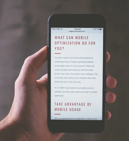
When it comes to giving your customers the best online experience possible, you need to have a responsive and easy-to-navigate mobile site. As well as ensuring all parts of your customer facing business are on point, with mobile internet browsing more popular than desktop – a good mobile site can help boost profits, too. Of course, regular websites can be viewed on mobile devices. But, the site speeds are slower as sites designed for desktops have a number of additional re-directs during navigation. While that doesn’t slow laptops or desk tops down, the small processors in mobile devices means this feature can delay web page loading by up to 5 seconds. And that can feel like an eternity to some browsers!
In addition to ensuring potential customers can easily use your site when they browse from their mobile, there’s another big reason to have a mobile optimized site. Mobile site speed is a key component in Google page rankings key component in Google page rankings. If your mobile site speeds are considered too slow, you’ll be penalized with a lower search result ranking.
Enter AMP
But don’t worry, there’s an easy way to create a site that’s optimized for mobile, with Accelerated Mobile Pages, or AMP. This initiative was created to make existing and new web pages, load quickly and correctly on mobile devices. With mobile web usage still growing, it’s more important than ever that all businesses have a website that’s fully optimized for mobile use. But, while that might sound like a big job, with AMP it can be easier than you expect! There are four easy ways to integrate AMP into your website, to ensure you have a great desktop site and a usable mobile site, too. To find out more about them read on.
Convert Your Existing Site with an AMP Plugin
This option is the simplest for those of you with little technical know-how and an existing, desktop optimized site. There are a number of sites that offer free AMP plugins and it’s an easy process to follow.
- Select the plugin you like best, that also supports your existing website.
- Download the plugin.
- Follow the specific directions and the plugin will add in the AMP coding required to optimize your pages for mobile.
It really is that simple. But be warned, while this type of AMP plugin will ensure your website will be perfectly compatible for mobile browsing, it won’t magically transform your site into an easy-to-navigate and user-friendly experience. If your site needs a revamp to make it more usable for potential customers, you need to re-design your site and not just add the AMP plugin.
AMP Plugins for Web Development
If you’re building your website from scratch, then AMP plugins can also give you the ability to create a website for desktop that’s also optimized for mobile at the same time. This can be done by using templates and themes that have an AMP plugin, built in. You simply develop and design your website by choosing from a range of themes and templates that are AMP ready. This gives you - or your developer – the option to create a website that will look good on a desktop site and a mobile site. This option allows you to consider usability and image for all users on all devices. It might make the process slightly longer due to the thought you put into which themes and templates you use. But ultimately, that will result in a better website for all your users, regardless of where they open your site.
Create a Separate Mobile Site
If you want to have two websites – one for desktops and one for mobile – that’s possible too. You can use themes and templates that are specific to AMP – not with plugins. These templates and themes offer options that can be specifically tailored to your industry niche. So, one set of template and themes will work for restaurants and cafes. Another set created for retailers and yet another set for leisure and sport establishments. This option means you have more control over the way the site looks on mobile devices and really go to town on making it a great browsing experience for users when they’re on the go.
Employ an AMP Software Service Provider
An even easier – but more expensive – option, is to employ an agency to do it all for you! The best AMP agencies will be able to have a few meetings with you, review any existing website and marketing materials or guidelines you have and come up with the perfect mobile website for you and your customers. Of course, the best agencies will come with a premium price-tag. But, if you’re short on time and knowledge – or both – then it will be worth it.
Ignore AMP at Your Peril!
As the mobile audience increases all the time, the need for a site that’s fully optimized for mobile becomes increasingly essential for all businesses.
Being visible online and with a site that’s as easy to use on mobile devices as it is on a desktop, is an important tool for growing your market share and your profit. Embrace the move to mobile use with AMP!
By: Jackie Edwards